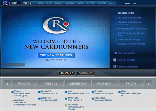
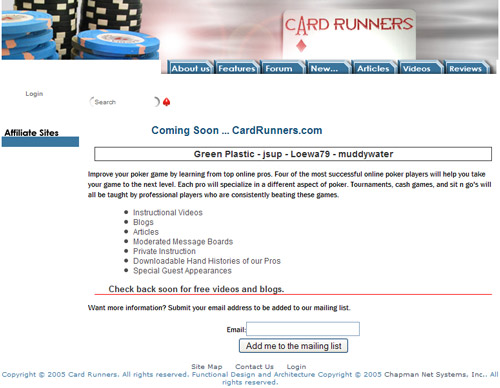
Just in recent times the popular online poker training site CardRunners has had it designers give it a makeover. Launched in 13th of July 2005 the site now is home for over 88,000 members and is considered one of the most known and popular poker coaching sites. Since 2005 the site has undergone numerous cosmetic and internal changes to help improve its usability and appeal. It has definitely come a long way for its first basic released design and with its recent changes, it shows us that CardRunners will like to keep growing forward by keeping up with the demands of its ever increasing customer base.
CardRunners look like this when is was launched (July 13, 2005)

CardRunners looks like this now, after just a ‘few’ changes 🙂
New forum engine
In my opinion the designers have done a really good job this time round. The homepage has a crisp fresh look which is not only eye-pleasing but also is easy to navigate through. Changes have also been made to its old forum, which was a nightmare to use. A totally new forum engine, the vBulletin is now in use. The decision to change it to the vBulletin (the most popular forum engine used on the web) will offer a more enjoyable experience for new and existing users.
Other improvements include
Time Stamps: Time stamps are a quick way to identify and mark a certain spot in a video for the purposes of creating Discussion Notes or Personal Notes
Discussion Notes: Discussion notes mark spots in videos and post comments or questions to be viewed by members and instructors. Discussion notes are saved for later use.
Personal Notes: Your own personnal notes attached to the video.
Biggest downfall on improvements -> loading time issues
Although the site has undergone a few welcomed improvements over its predecessor, developers have forgot to look at ways on how to improve the page load time, which still remains quite frustrating.

